

Transformed the user experience of Kepner-Tregoe's corporate website, leading to a 200% surge in site traffic and a reduction in bounce rate from 90% to 54%.
Product Designer
Product Design
Visual Design
Research
July 2021 - December 2021 (5 months)
Transforming digital presence into a functional asset.
Kepner-Tregoe, a global consulting and training company, specializes in structured problem-solving and decision-making methodologies, catering to corporate teams and individual experts seeking performance improvement.
They had a clear understanding that their public website was far from being an effective lead-generating tool and were looking to transform their digital presence into a functional asset. As a product designer on the project, I was responsible for the entire design thinking process. I created a useful and credible site that resonates with Kepner-Tregoe’s audience and serves as a true source of pertinent information.
How can we improve user satisfaction and reduce site bounce rates by enhancing overall user experience and quality content?
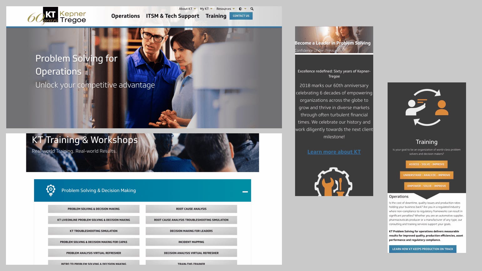
Kepner-Tregoe (KT) approached us with several issues affecting their website efficiency, leading to challenges reported by clients, particularly in navigation and finding information required for meetings their goals. One of the key concerns KT wanted us to improve was a high bounce rate of 86-92%. Additionally, the website lacked a modern design that aligned with industry standards, and it wasn't fully responsive across various devices, impacting the overall user experience.
"As a manager seeking to upgrade my team's skills, I want to quickly overview your offerings and identify relevant options. It's time-consuming and frustrating to scroll through the entire page to find the information I need."
Usability testing results highlighted users' struggles in finding information that met their requests and expectations. This challenge was attributed to the confusing website architecture, inconsistent UX, and cluttered UI. To address these issues and optimize our improvements, we began by understanding the fundamentals—our users.
Who are KT’s users, what are they seeking, why, and how do they engage?
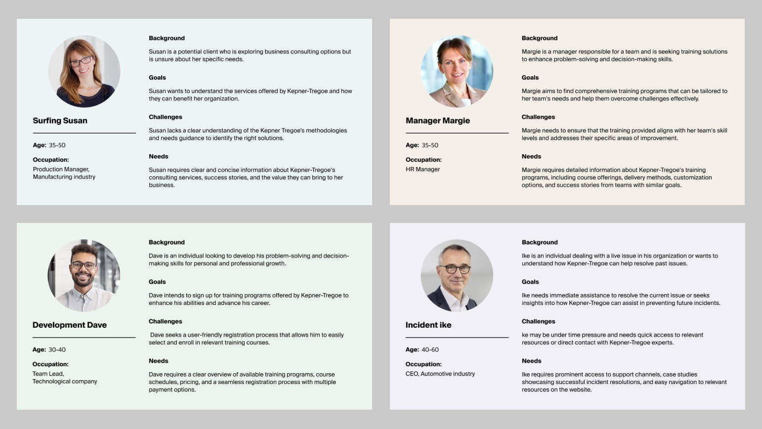
Kepner-Tregoe caters to two primary user categories: those in search of consulting services and those interested in a learning path. These groups vary in motivations, goals, pain points, and expectations. In the user research phase, our main objective was to cultivate empathy for our users.
Collaborating closely with the project manager and KT's VP of Global Growth and Customer Service, I conducted a series of user interviews, from which I derived detailed user personas guiding design decisions.
Despite diverse needs, our research unveiled a shared desire for transparency and trust. All eight participants in our user interviews emphasized trust as a critical factor influencing their decision-making regarding a service provider.
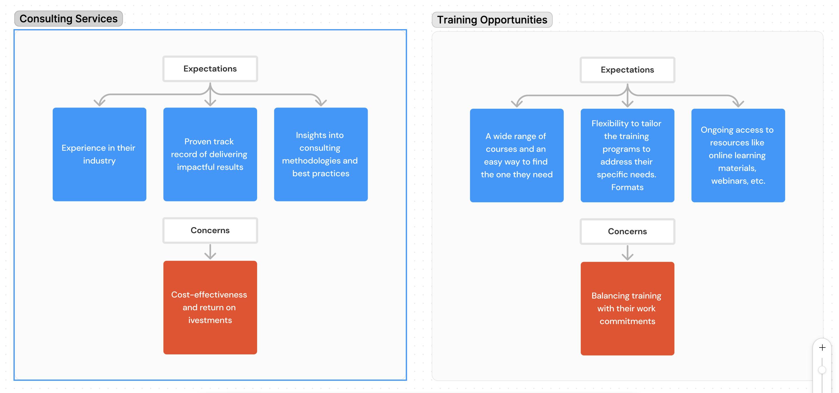
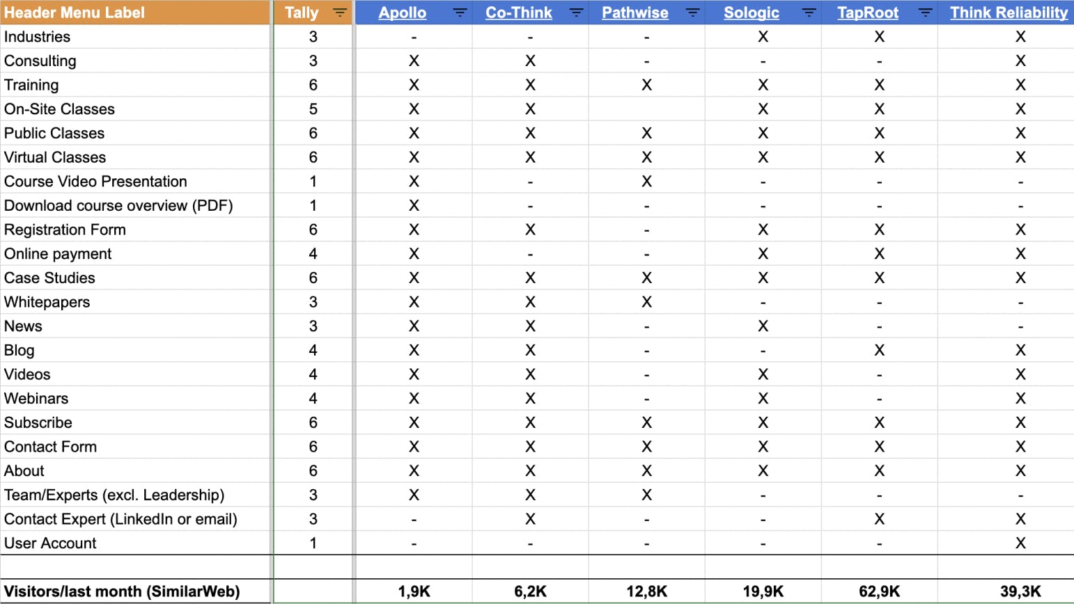
As part of our research, I conducted a competitor analysis to explore the market landscape and assess competitors' strengths and weaknesses. This analysis proved instrumental in recognizing opportunities for functional improvements and redefining KT's objectives.
Our objectives were centered on creating a user-centric website tailored for corporate teams and individual learners.
- Navigation: Streamline the website for intuitive use, ensuring easy access to information and functionalities.
- Context: Provide relevant information for learners to select suitable programs and aid consultancy seekers in making informed decisions.
- Interface: Modernize the website's design to align with industry standards, enhancing visual appeal and usability. Go for a minimalistic and ultra-clean aesthetic (preferred by the client).
- Competitor Benchmarking: Identify best practices to differentiate KT positively in the industry.
- Bounce Rate: Significantly reduce the high bounce rate by optimizing landing pages, improving content relevance, and ensuring a smooth user experience.
- Performance Optimization: Enhance website performance for faster loading times, improving overall user satisfaction and engagement.
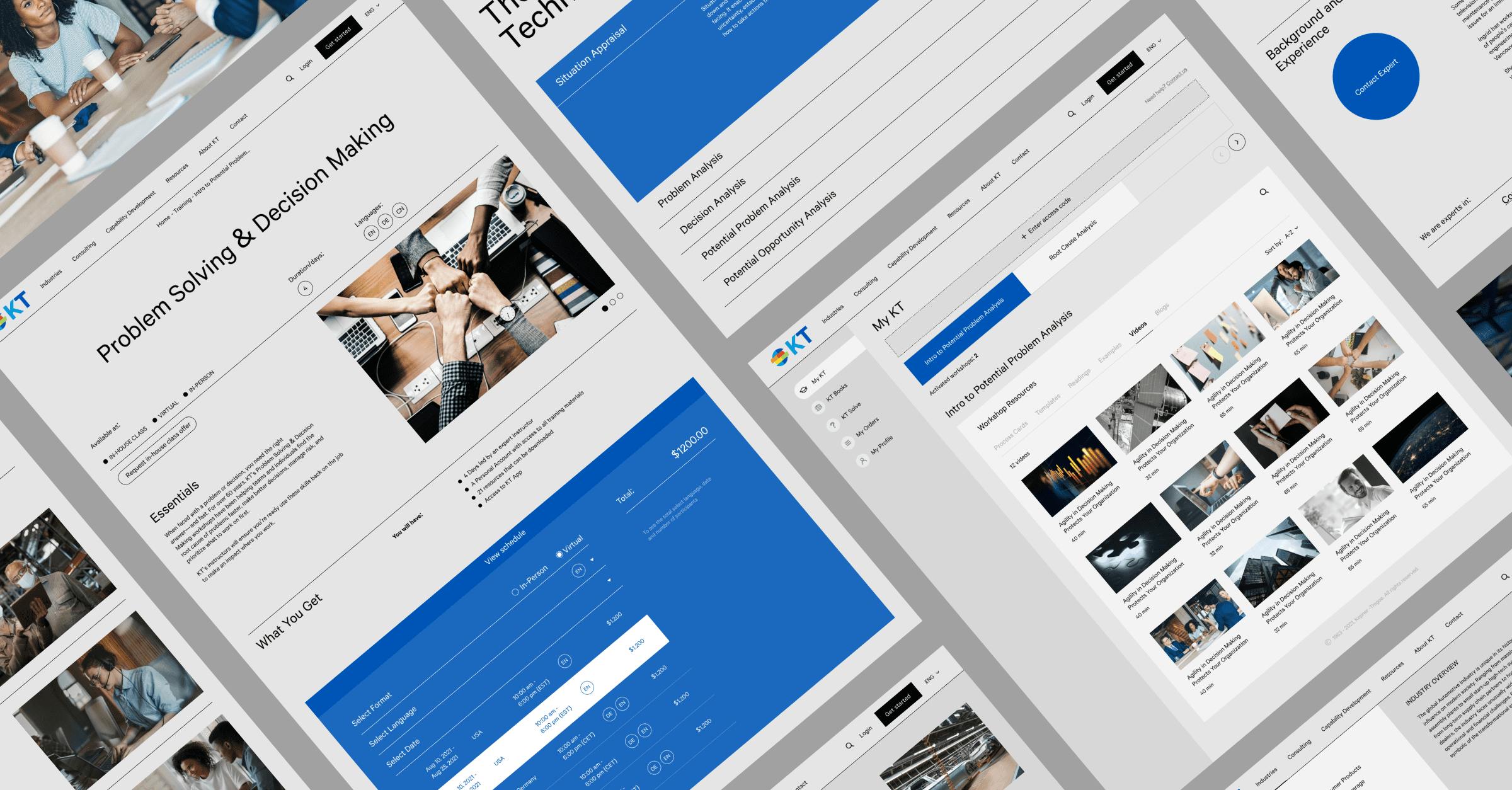
I reimagined the information architecture and website structure to ensure visitors follow a logical user journey when exploring information on KT’s website.
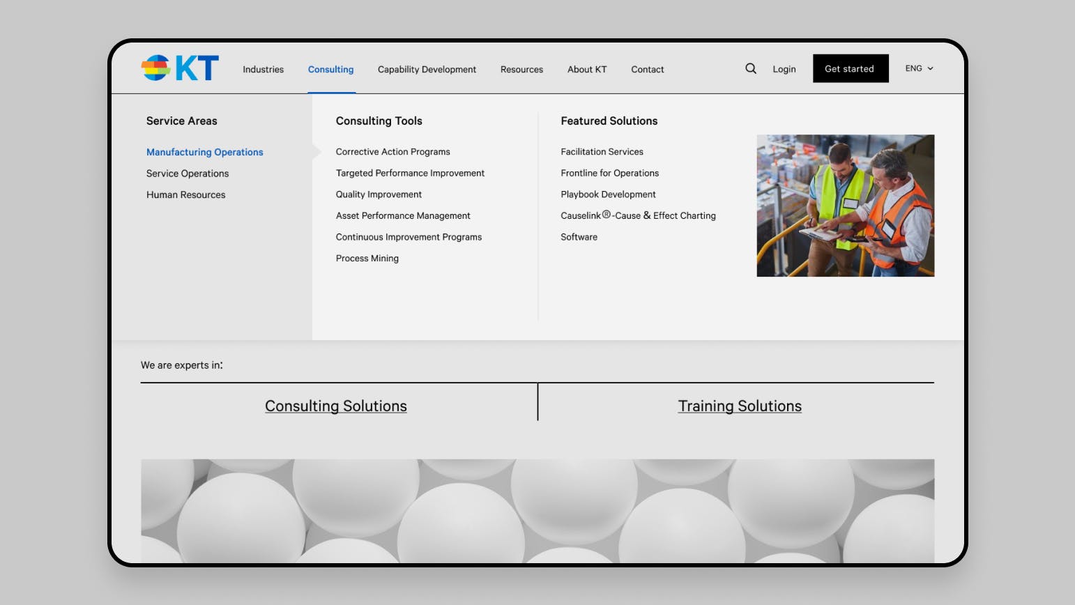
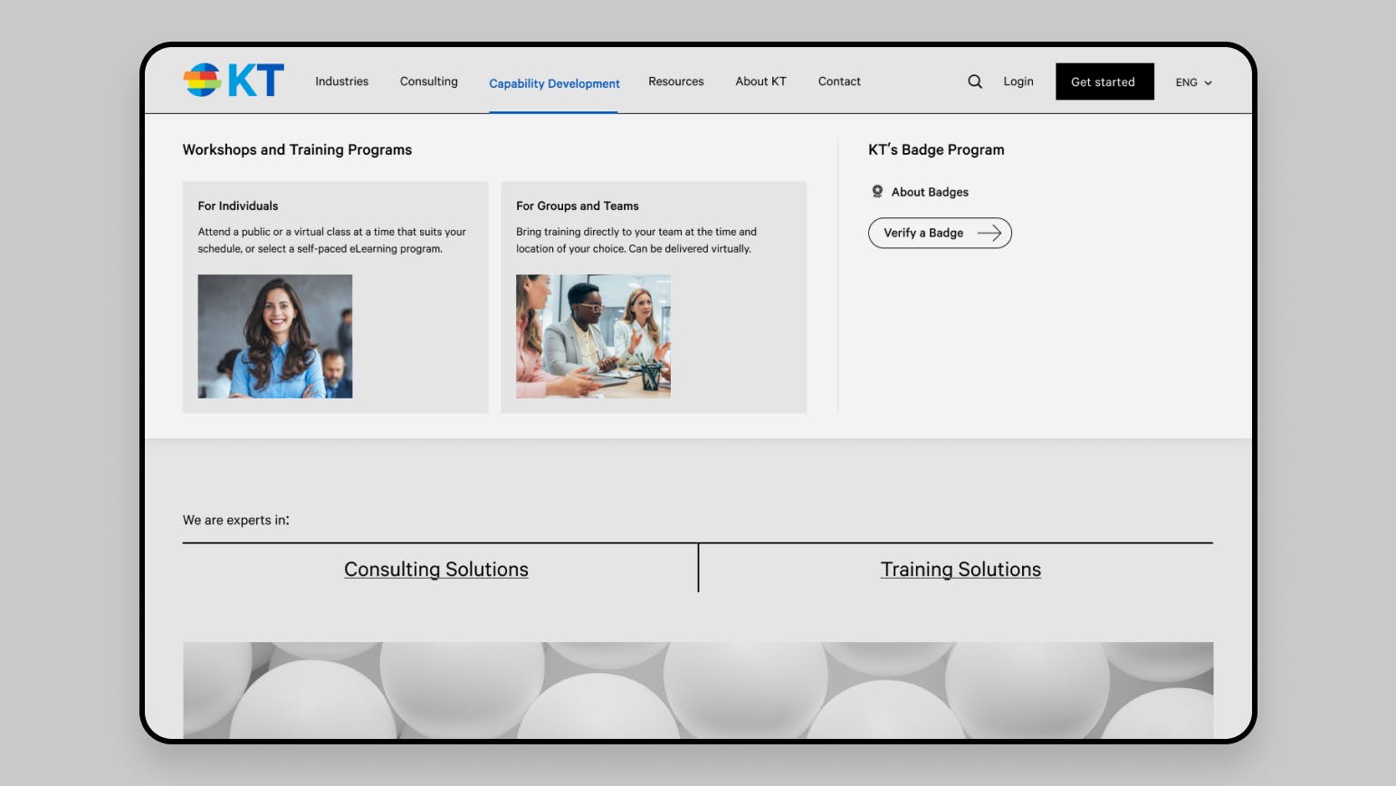
By mapping out the desired user experience, I redesigned the order and organization of pages, creating a user-centric navigational system of menus and content. Since many KT users are unsure whether they need consultancy services or a training program, I implemented mega menus to guide users through the choices, revealing options at a glance. I built straightforward connections between the content pages, ensuring consistency of the user experience within the information architecture. This set of improvements enhances information visibility throughout the user journey, facilitating the fulfillment of their goals.
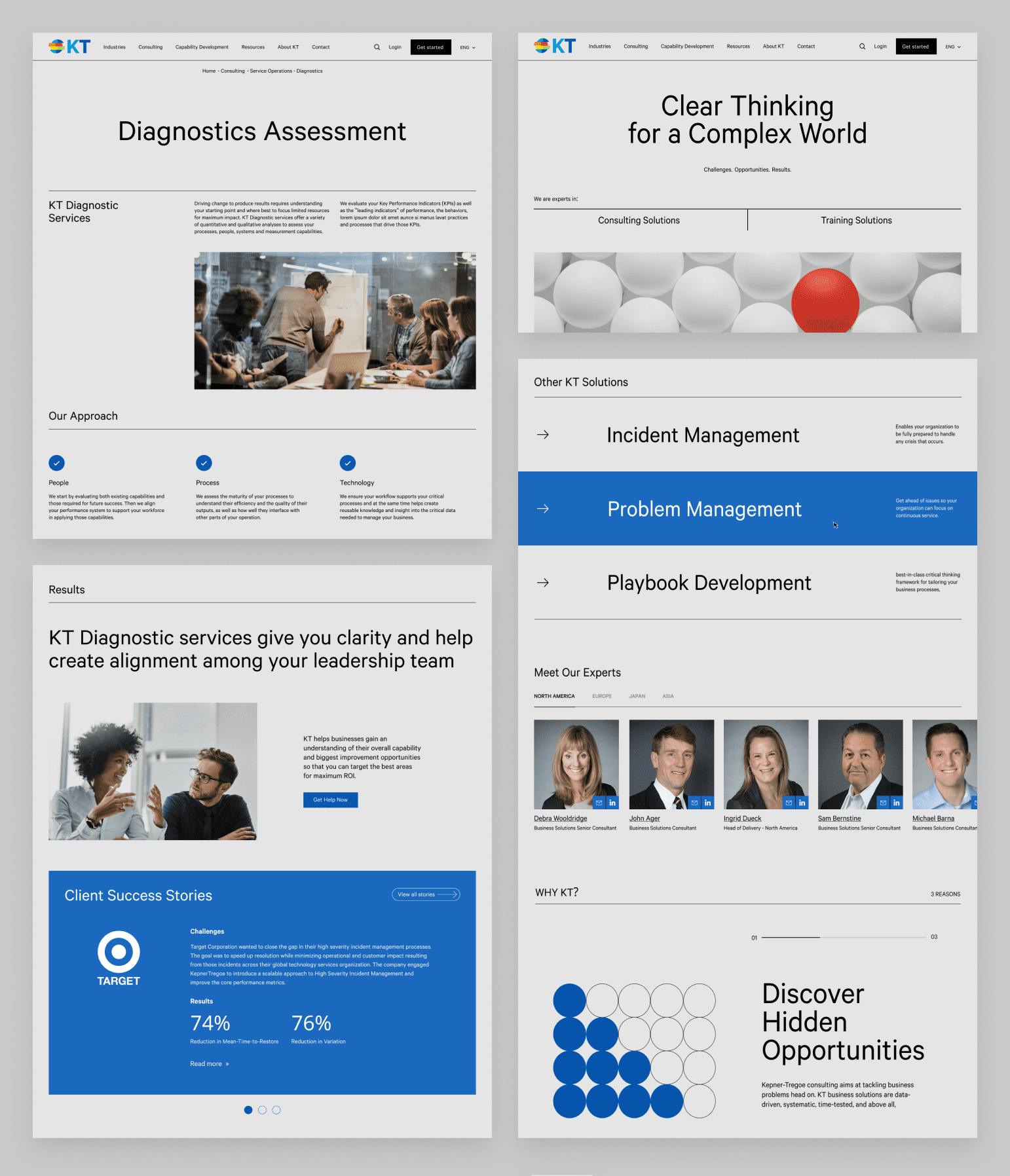
To align with users' search behavior for consulting services and build trust, I highlighted KT’s expertise across diverse industries.
During the research phase, we discovered that users consider industry-specific experience a crucial criterion when choosing a consulting service provider. Additionally, 72% of test users emphasized the importance of including their industry in search requests for consulting services. To address this, I introduced a new site category showcasing KT’s work across various industries through the latest insights, client success stories, and relevant solutions.
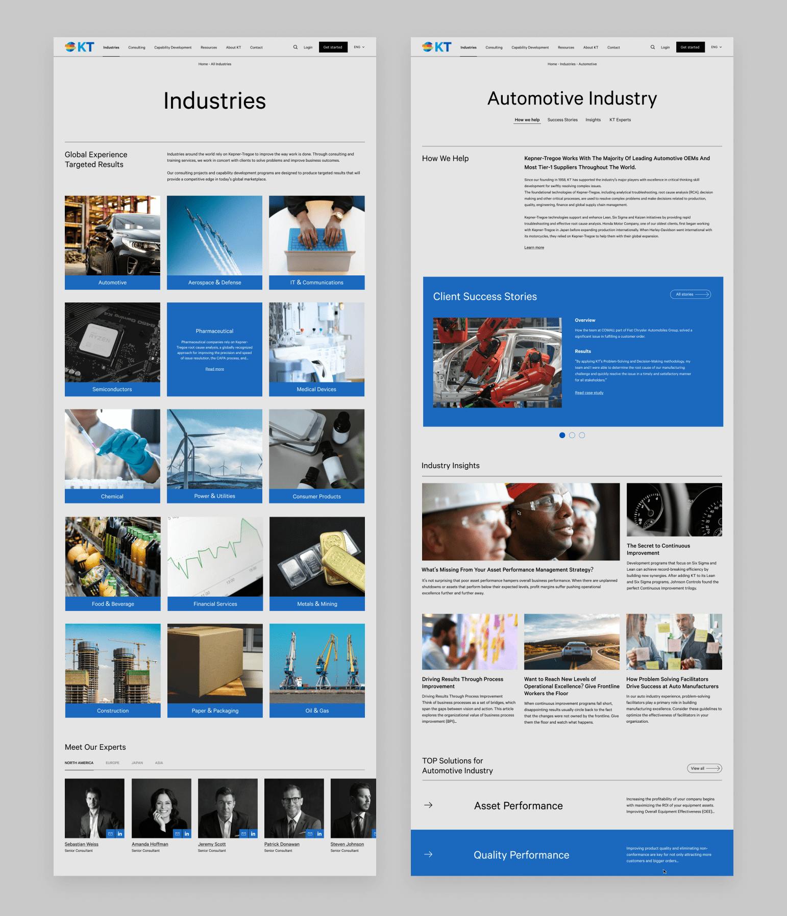
By introducing KT’s experts (consultants) on the website, we further enhanced user trust and transparency.
Adding the 'Our Experts' block on the main content pages was a meaningful solution, supported by the results of our initial prototype testing. I also introduced a non-modal popover feature for quick connection with an expert. At any moment on the site, users can reach the consultant leaders in their area in one click or learn more about their expertise and experience.
With the improved user experience, we reduced the time spent on finding the right workshop and registering for it by 2.5 times.
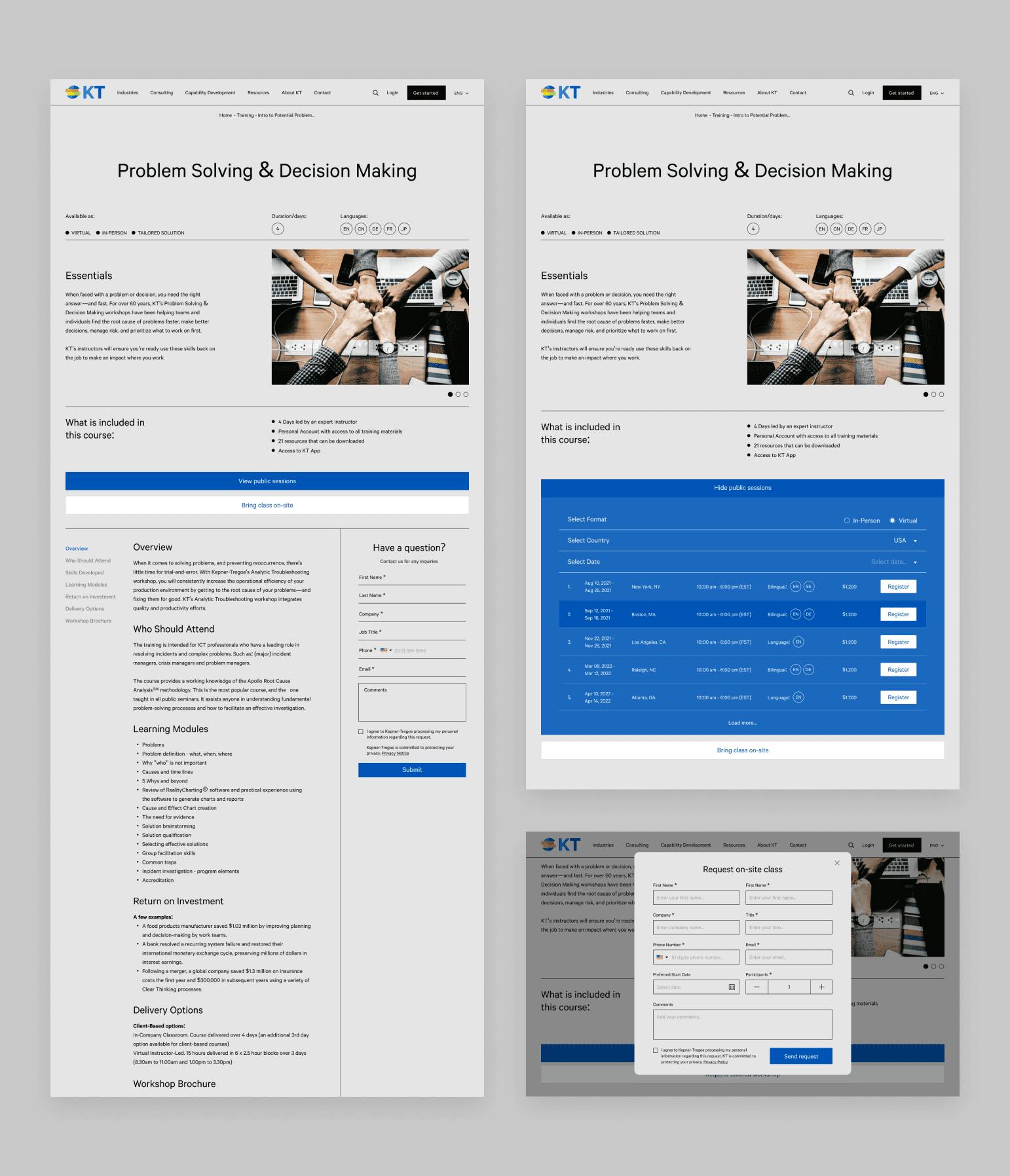
Users previously had to navigate through three unnecessary pages before reaching the detailed view of the workshop they were interested in. This experience discouraged site visitors and made them feel like they were wasting their time. To address this, I eliminated the unnecessary steps and created a straightforward user journey, enabling quick and easy access to a product page. I designed a simple workshop catalogue where users can filter workshops according to their preferences and goals, all on one page and within a few clicks.
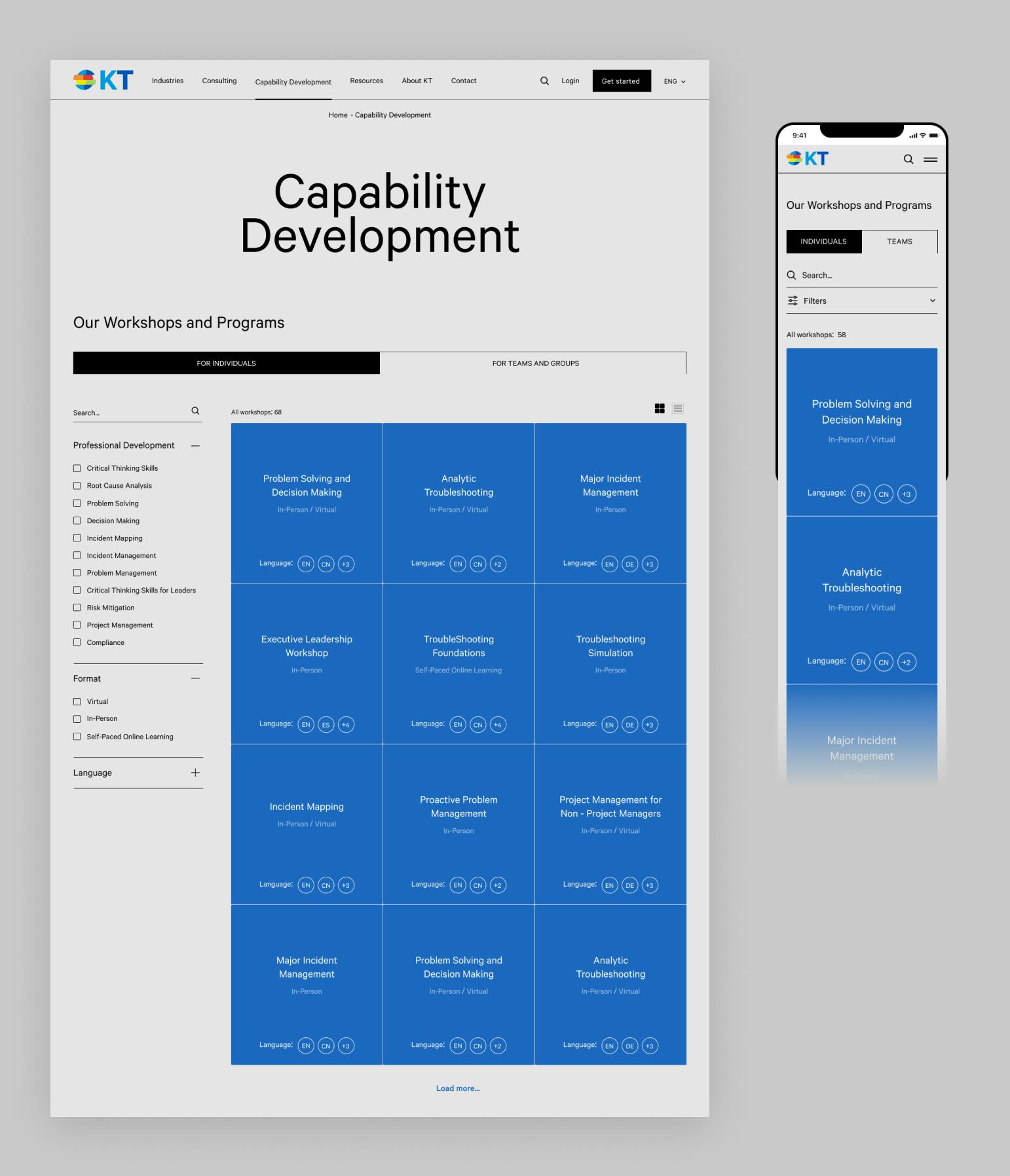
Redesigned the workshop detailed page experience to better cater to training opportunities for both corporate teams and individuals.
While the primary audience is corporate teams, the previous user experience seemed tailored more toward individuals. KT offers training programs in three main formats: virtual sessions, in-person public sessions, and customized solutions that can be either virtual or at the customer’s preferred location. To present these options more clearly, I separated public sessions and custom solutions as two distinct entities targeting different user categories with diverse needs. Public sessions are scheduled in advance, allowing users to register directly on the site, while tailored solutions necessitate direct discussions with the client. To facilitate this, users can now submit requests through a lead generation form. These improvements provide users with a clear understanding of where to go to fulfill their specific needs.
With 36% of mobile traffic, ensuring a satisfactory experience for mobile users was imperative.
Driven by the concept of an ultra-clean, minimalistic interface, we applied the same approach to the mobile version of the site, proving highly effective given the limited screen space.
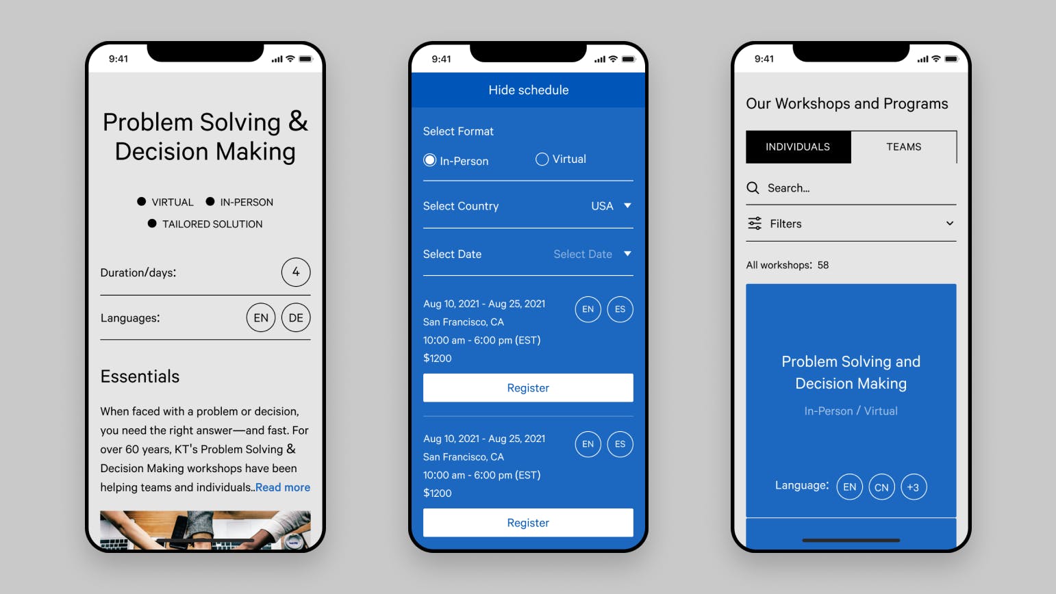

By decluttering the user interface and establishing a clean and consistent look, we guided users to focus on their goals without confusion or distraction, enabling them to perform tasks easily and quickly.
After several iterations of improvements and user testing, we launched the new site, coinciding with Kepner-Tregoe’s 64th anniversary, and received satisfactory results.
After launching the site a little over three months ago we have seen our traffic and leads rate more than double, while bounce rate dropped from 90% to 54%.
Phillip Thompson,
VP of Global Growth, Client Services & Marketing, Kepner-Tregoe
If, after a client meeting, you've received answers to all your carefully prepared questions but still feel uncertain, chances are, you asked the wrong questions.
Additionally, if you're basing your assumptions on partial information and have a logical guess, you're likely to be mistaken; there might be no logic in the current UX solutions or the client's internal processes. However, by redirecting our research approach toward more profound communication with the client's team, I saw setbacks transforming into successes. This project served as a personal lesson in active listening and critical thinking, both essential skills for designers.
Next WORKS


Enhancing user experience for corporate efficiency. Doubling user retention and increasing user satisfaction by 82%.
Elevating Sergio Jimenez's 18-year expertise into a vibrant, cinematic, and trustworthy web representation
