

WAIE, Contactless Fueling Platform - Elevating User Experience for Corporate Efficiency
Product Designer
Research
Product Design
Visual Design
April 2023 - October 2023 (5 months)
How can we make contactless payments at gas stations more accessible? How can we streamline information access for our customers, minimizing friction? These were the primary questions we sought to answer to enhance service and improve the customer experience. It was also an excellent opportunity to delve deeper, analyze customer pain points, and deliver a better experience through design thinking, UX, and product design.
ALDREES, a petroleum and transport services company boasting 500+ gas stations across Saudi Arabia and neighboring countries, introduced WAIE, an electronic fueling system. The system equips gas pumps with Radio Frequency Identification (RFID) that identifies vehicles by a tag installed near the gas tank. Tags contain predefined fueling criteria, providing a secure, convenient, and cash-free service to customers.
As a product designer, I was responsible to conduct the initial discovery and research to uncover main pain points and define success metrics that were relevant to the business.
I also was responsible for the visual design, interaction and navigation of the mobile and web application to define better ways to simplify the user experience around data consumption and interaction.
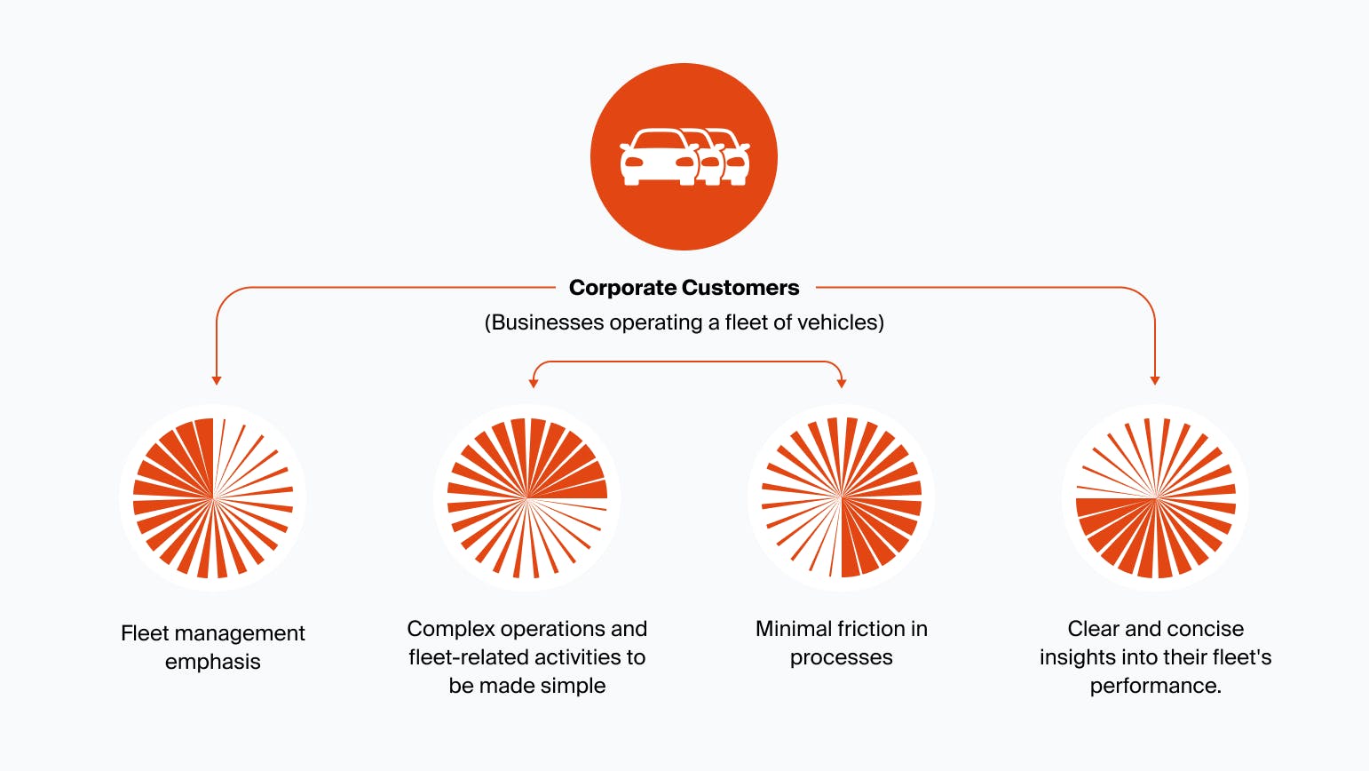
While WAIE was initially built with corporate customers in mind, catering to companies operating multiple corporate vehicles on a daily basis, it lacked fundamental features to meet their needs and expectations.
In addition to lacking functionality, we uncovered pain points causing frustration and a reduction in customer engagement with the existing user experience:
- Customers had to perform too many steps to complete major actions, from registration to adding a vehicle to a fleet.
- Customers had to make many extra clicks to fill out forms and other inputs.
- Customers had to guess where specific actions could be found due to confusing navigation and a poorly structured app.
- Overall, users experienced significant interaction and cognitive friction on their path to completing tasks and achieving goals, drastically affecting the retention rate.
In collaboration with another designer, a product manager, and a sales executive representative, I conducted user research to better understand users and their needs. I synthesized user interview findings into wireframes and the initial prototype.
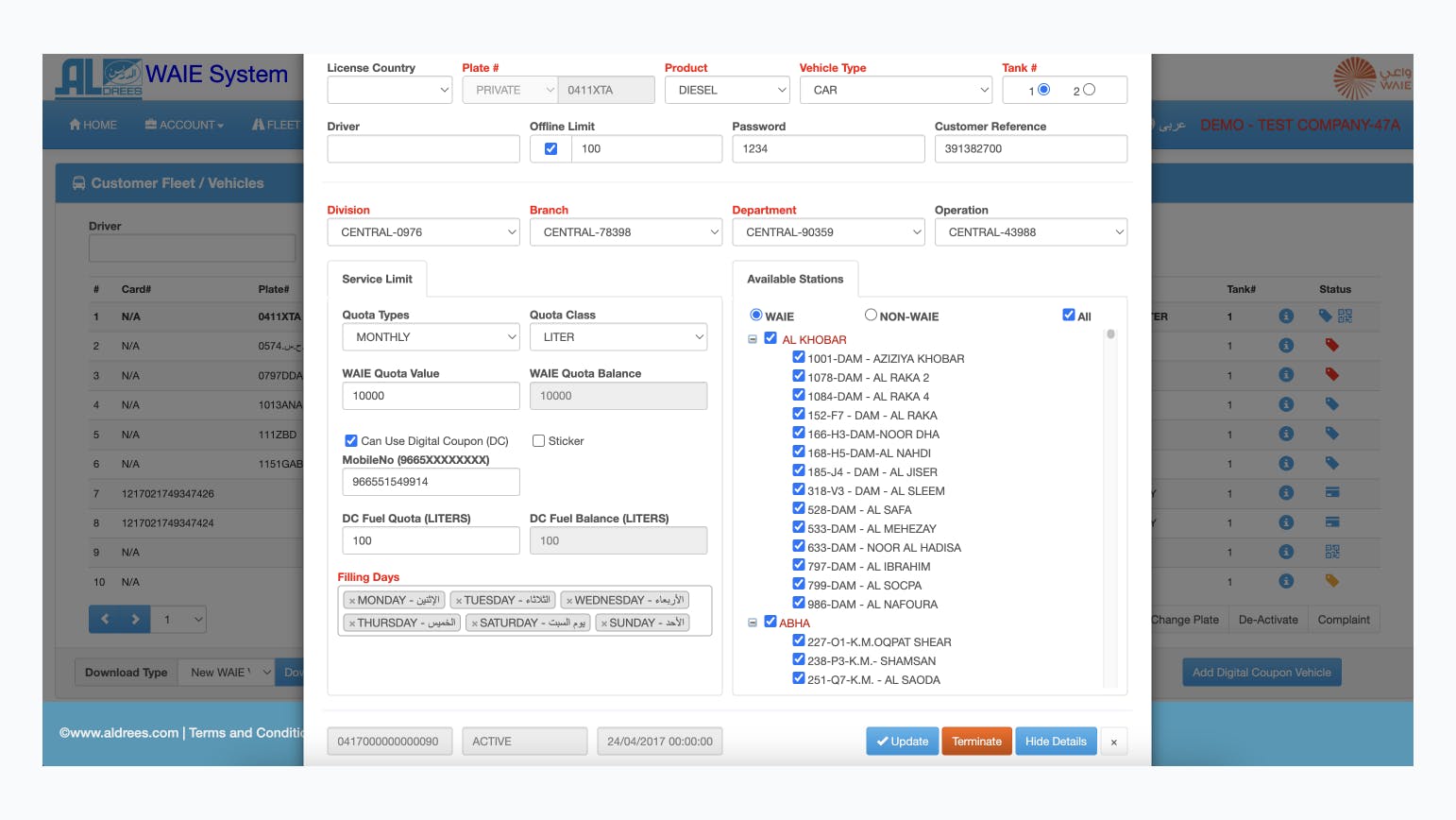
Through the research, I discovered that the most common complaint was about fleet management limited to one-by-one actions.
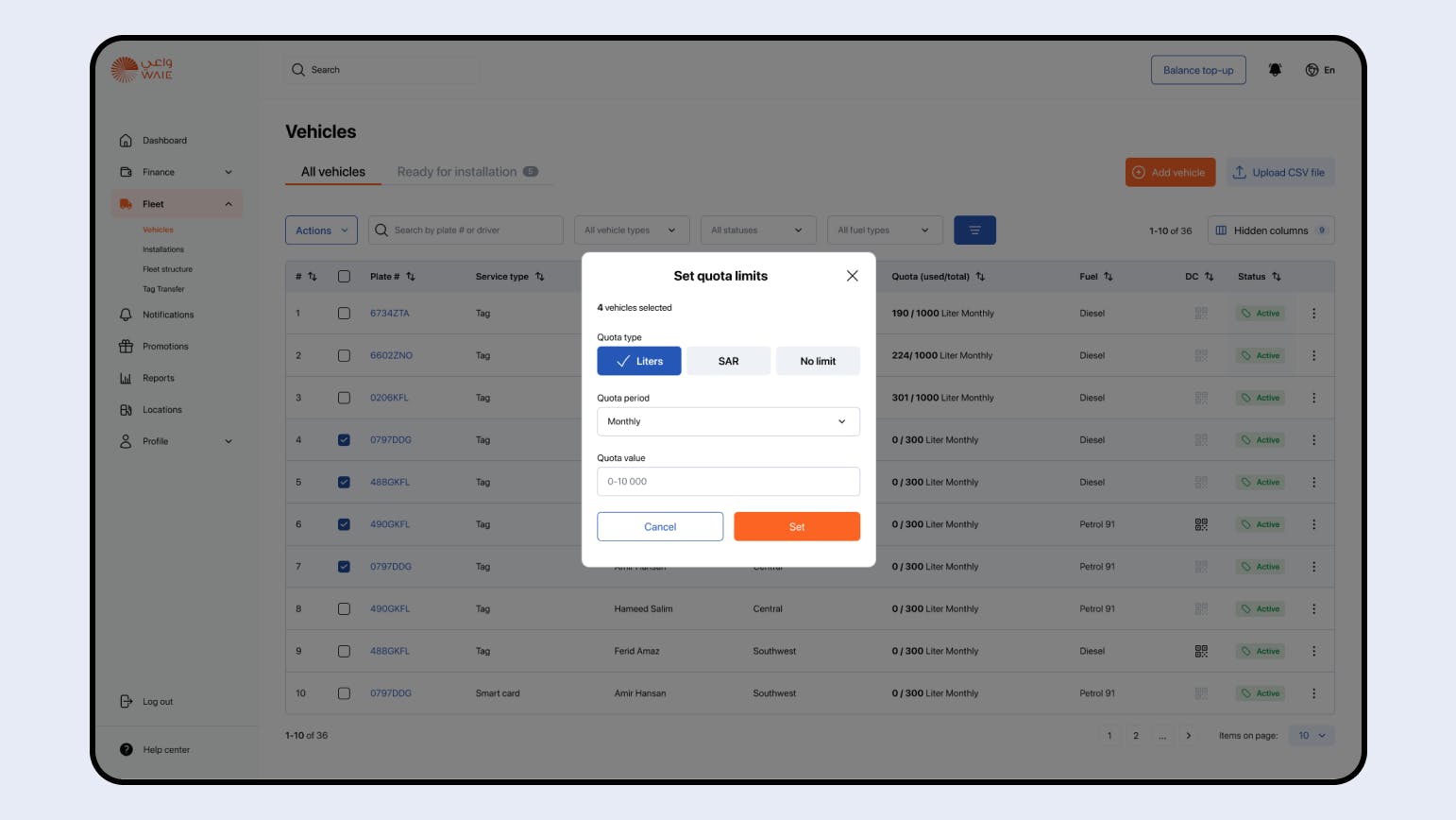
Users could set fuel quota limits or terminate service for a vehicle, but they could only do it for one vehicle at a time, making the process time-consuming and exhausting.
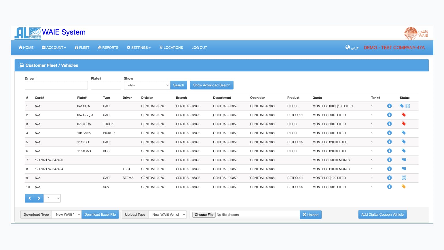
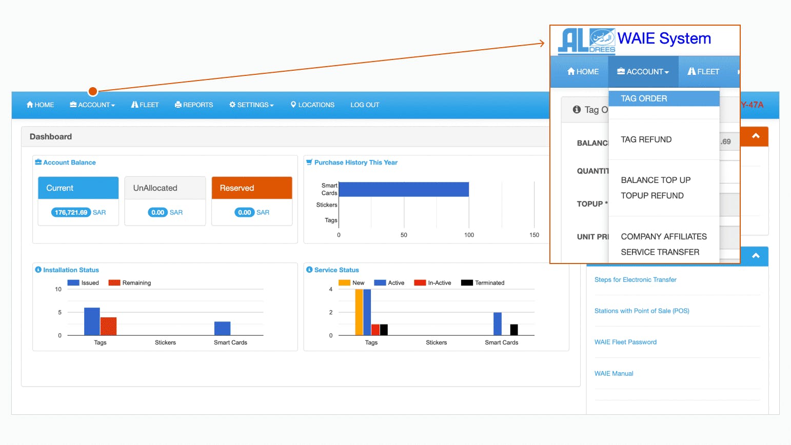
Additionally, users had to navigate to individual vehicle pages to perform these actions, lacking direct access to the necessary buttons from the main Fleet page. Considering the long loading time, it proved time-consuming even for one vehicle.
“I feel like I should be able to do something obvious, but I cannot figure out how to do it.”
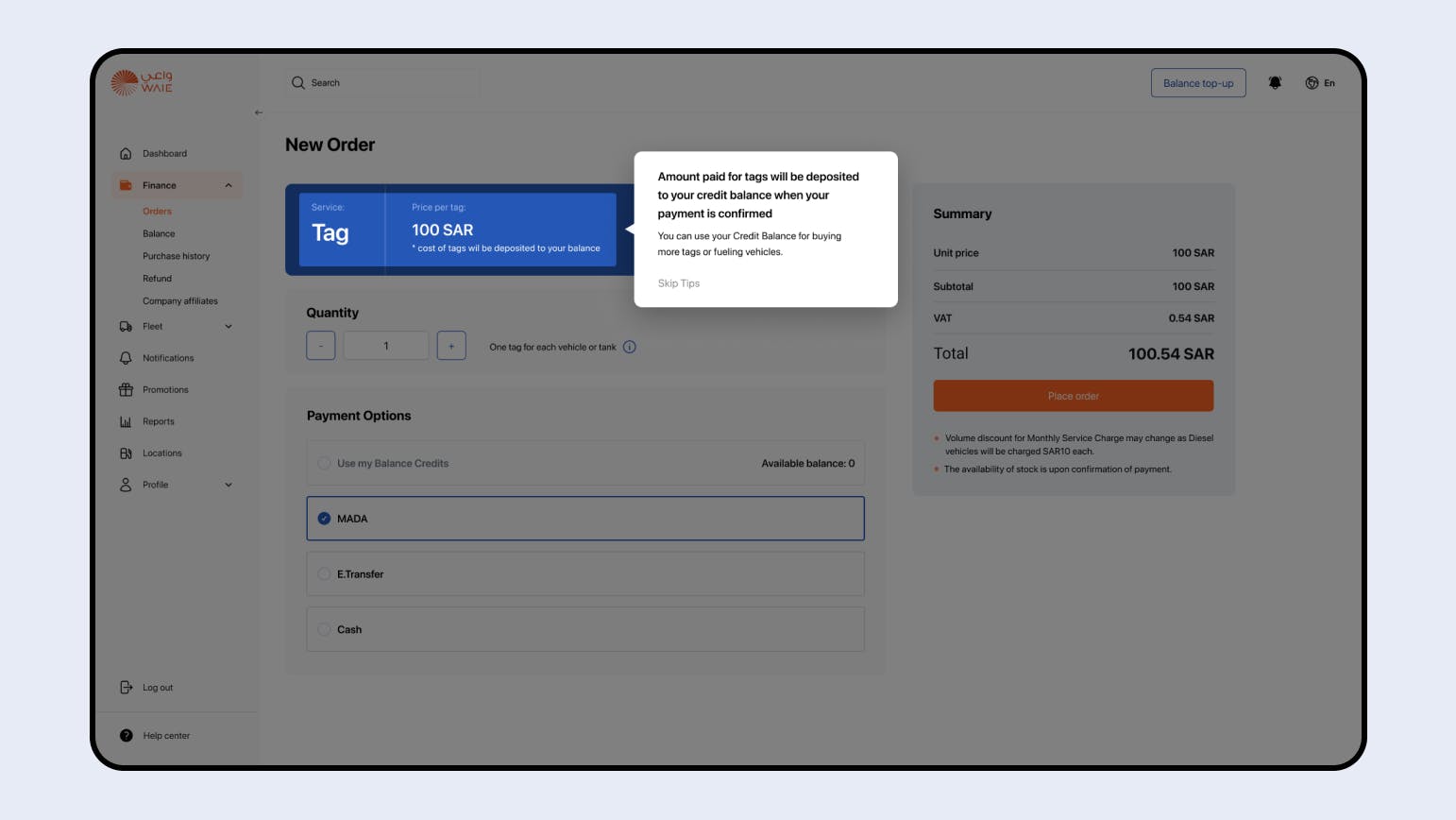
Customers, when fueling a vehicle, had the payment for gas withdrawn from their digital wallet. However, finding how to purchase tags and top-up their balance, crucial events for the system, was a significant challenge for users. All 10 test users found the navigation unintuitive, causing frustration and making them consider stopping the use of the site.
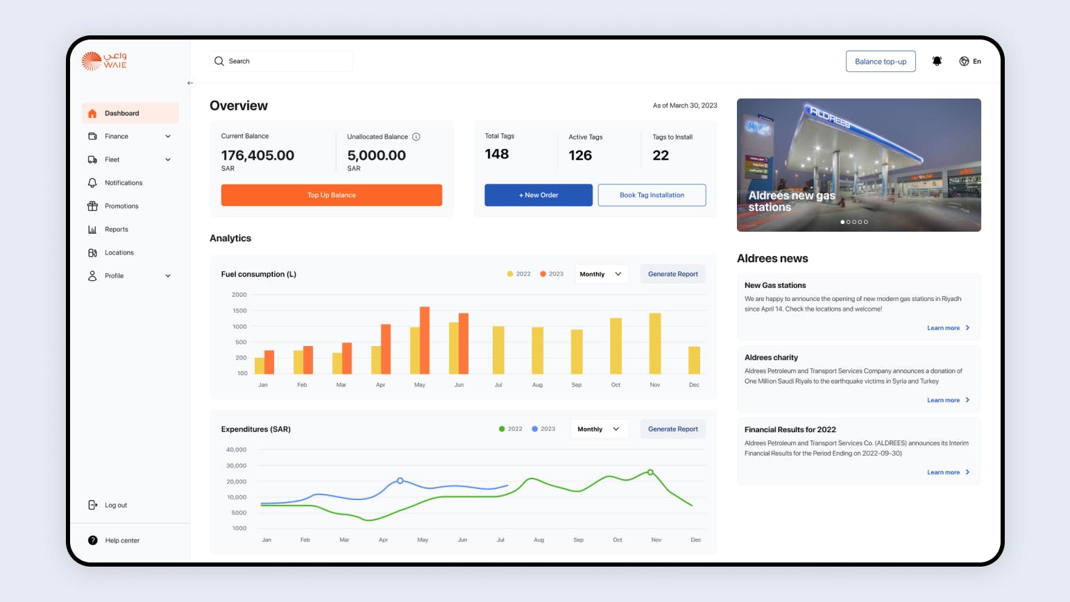
“I have over a hundred vehicles in my fleet. I'm expecting to see the fuel consumption in my active vehicles by month. I don't really care about the number of deactivated tags"
The dashboard page was a focal point during the user research phase. Although we were aware that the content had limited relevance, our challenge was to pinpoint the key metrics that our users would find most valuable in their daily business operations.
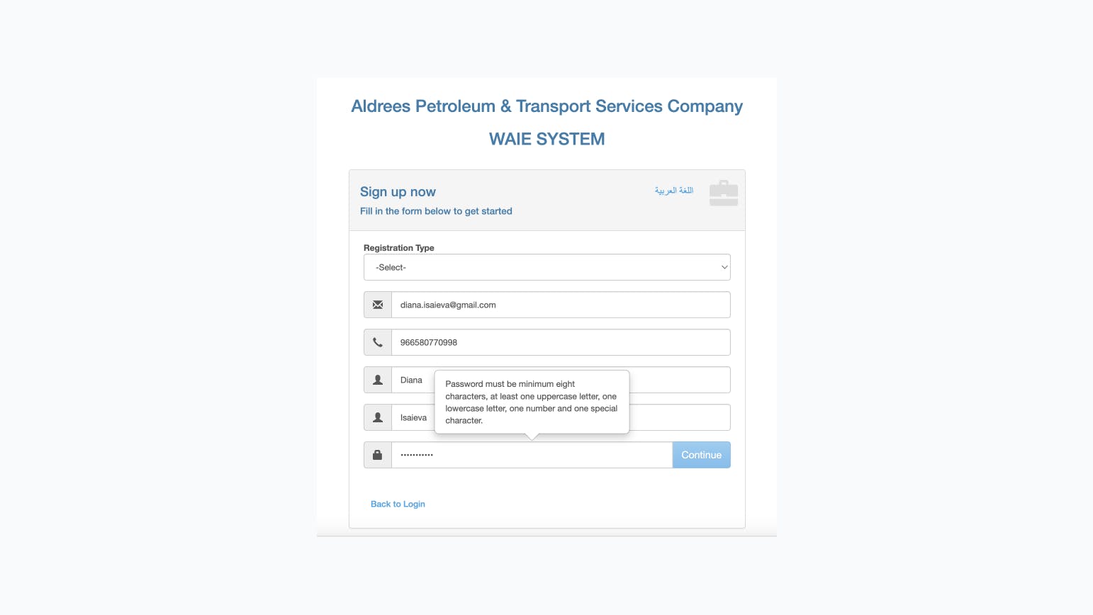
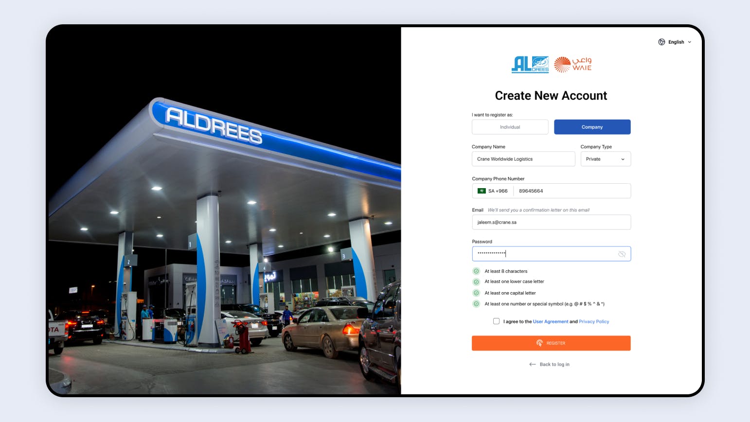
60% of test users felt confused during onboarding. They struggled to notice they had to choose a registration type in a dropdown selector as the first step.
While entering their personal details in the fields below, the "Sign Up" button remained inactive due to the missing registration type selection. Users struggled to figure out the reason behind this issue. The persistent password requirements popup, even after the user's password met the criteria, led users to believe there was a problem with the password. Most users started adjusting their newly entered passwords, although alternatively they could press"Sign Up" button to receive a prompt about the missing input. This friction scenario brought about extreme
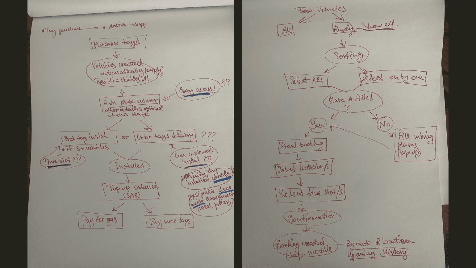
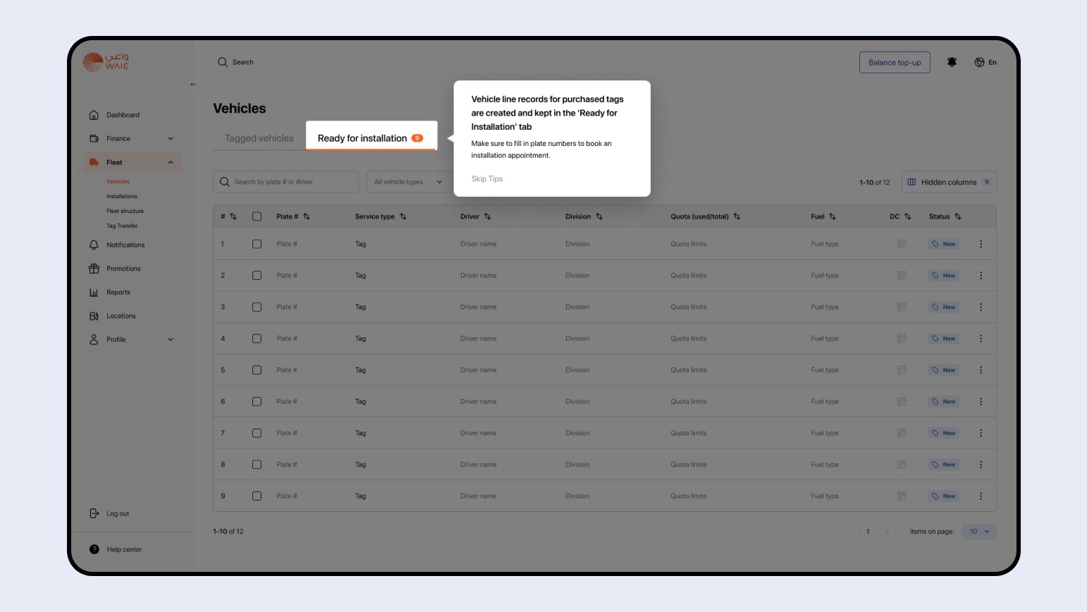
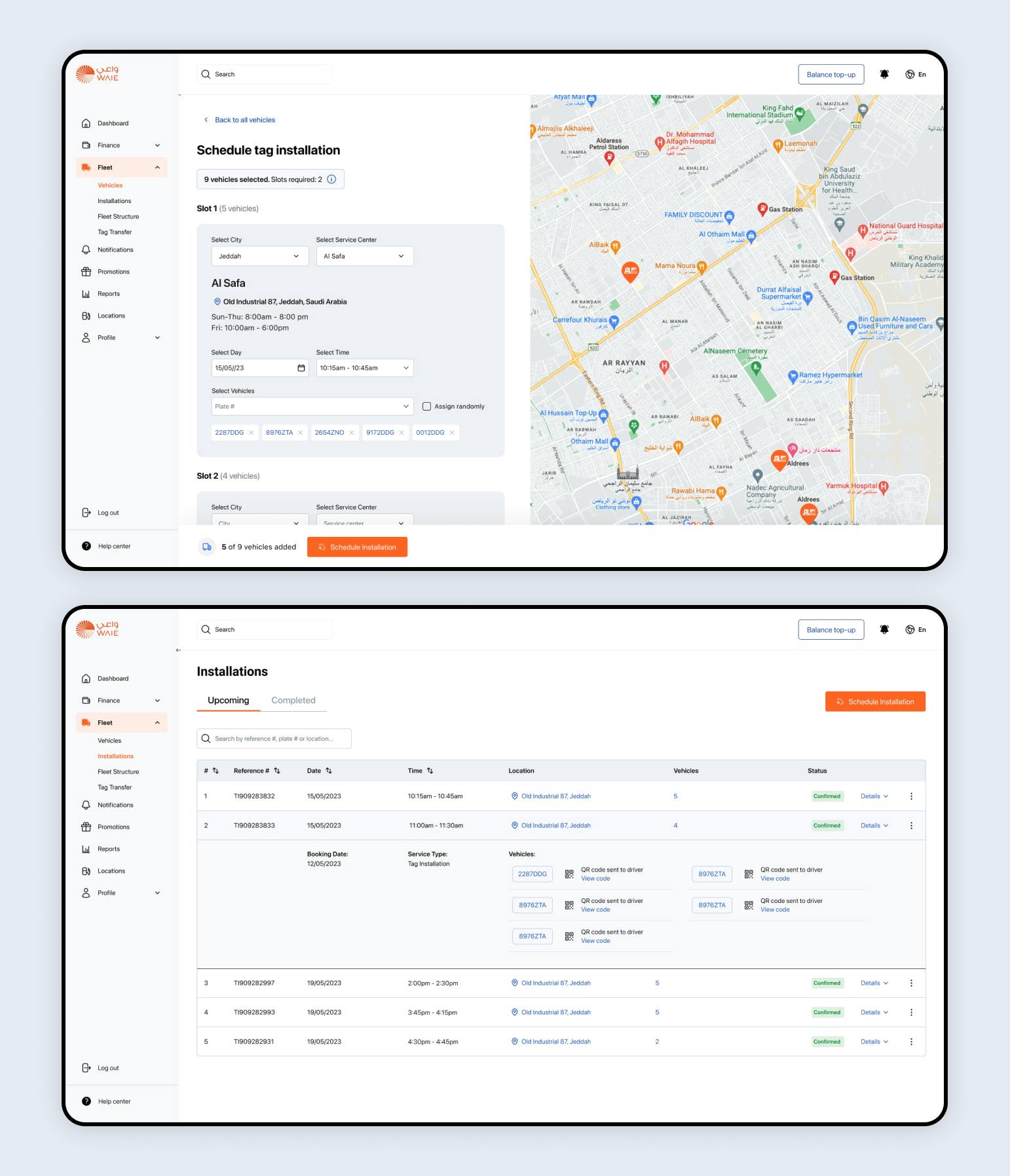
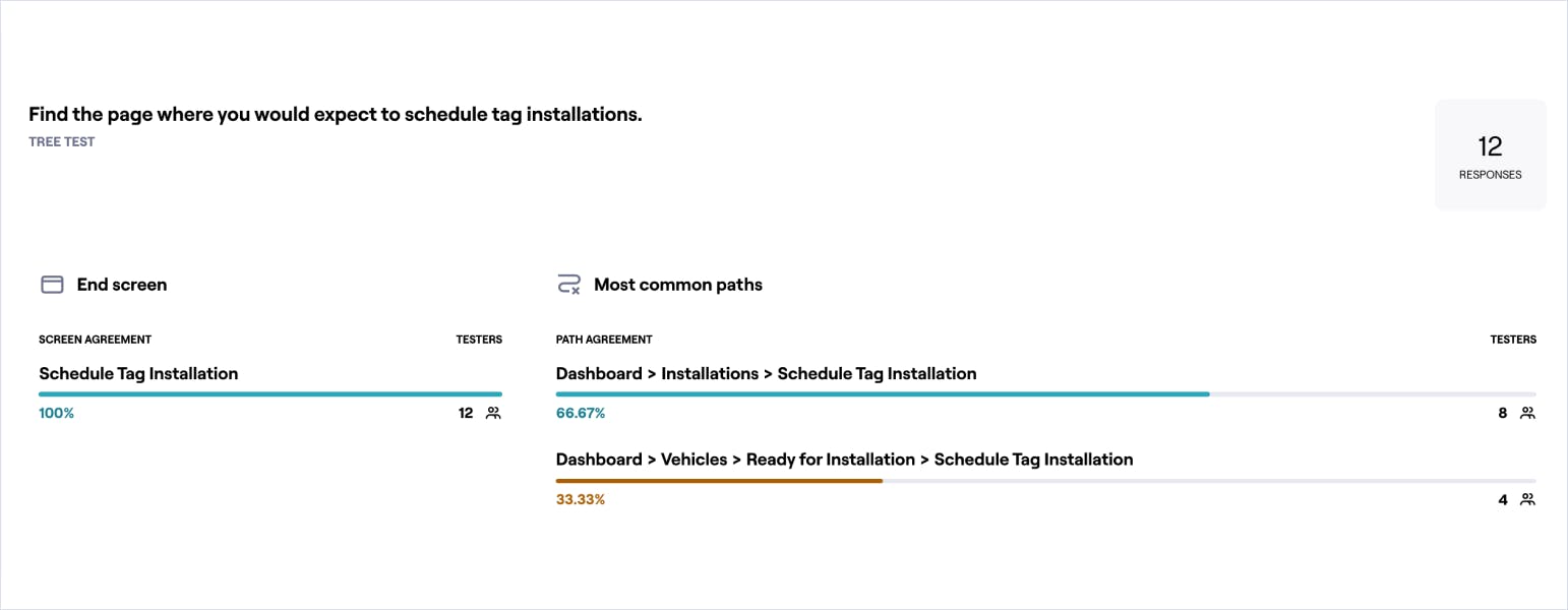
Stakeholder interviews revealed a big demand for an automated tag installation booking process, allowing users to schedule appointments on the site.
While tag installation is simple, taking around 5 minutes per tag, it becomes time-consuming for corporate customers operating dozens of vehicles. Previously, after purchasing tags, WAIE customer support representative had to contact customers via phone to coordinate installation appointments, often across multiple service centers and dates. This not only added undue strain to customer service responsibilities but also introduced unnecessary complexity into the lives of customers.
Create a better welcoming experience and improve the overall platform efficiency by meeting user needs and expectations.
- Flexibility and Adaptivity: Enhance adaptability for diverse fleet sizes, providing a seamless experience for users managing multiple corporate vehicles.
- User-Centric Onboarding Process: Ensure a clear and intuitive onboarding experience, focusing on visual cues and straightforward steps to minimize confusion and frustration.
- Intuitive Navigation and Information Discovery: Prioritize clarity in navigation, enabling users to effortlessly discover and interact with essential features.
- Automation: Streamline the tag installation workflow, emphasizing automation to reduce manual steps and enhance efficiency for both users and customer service.
- Clarity of Information: Focus on a dashboard design that prioritizes visual clarity, ensuring users have a clear understanding of crucial system events.
- Establish a distinctive visual style for WAIE, aligning with the newly crafted brand guidelines, setting WAIE apart from its parent company, Aldrees.
I led ideation workshops with the other designer, engineers, and product manager to brainstorm potential solutions.
One core consideration was exploring a fast and simple way for users to install tags themselves on their site. However, after thorough discussions with the stakeholders, we decided against this concept due to additional costs beyond the available budget.
Exploring how we might offer users a fast and simple way to have their tags installed and start using the service.
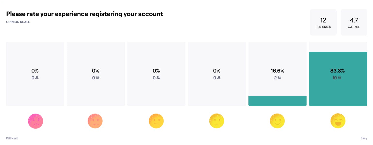
Revamping the onboarding experience significantly reduced friction and confusion. Test users completed registration within 90 seconds at most, compared to 2-4 minutes before the updates.
I made the "registration type" more prominent, preventing users from skipping this input. Additionally, I improved the frustrating user experience of creating a password by making password requirements visible throughout the time the field is selected and indicating progress toward compliance.
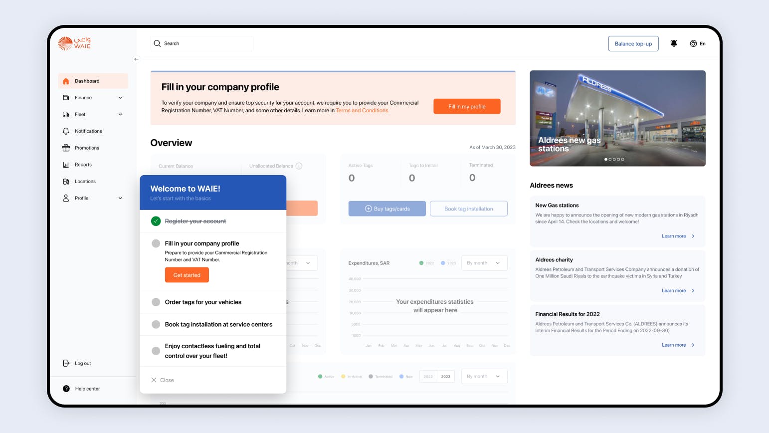
By walking users through the core functionalities of the platform, we drastically increased the user activation rate, with more users performing key actions and experiencing the product’s value.
After registration, users were previously left on their own to understand further steps due to the lack of onboarding in the previous UX. I designed an interactive user walkthrough to help users adopt the product faster. An onboarding checklist guides users through key events in their journey with WAIE. The interactive walkthrough takes users to the relevant page and directs them to the button needed for an action or provides a handy tip. These on-screen tutorials resulted in significantly higher user engagement and improved user retention.
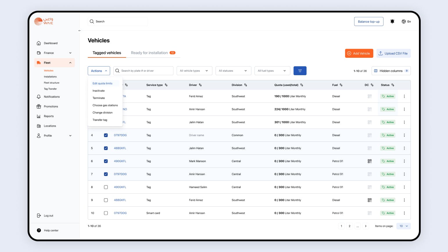
Transformed the messy and overcomplicated Fleet page into an intuitive experience aligned with the needs of corporate users.
I added a multi-select feature via checkboxes and a bulk actions dropdown, allowing users to manipulate and take actions on multiple vehicles simultaneously, a great time-saver for data-heavy content. As the page had low discoverability, I also significantly revamped the UI for easy navigation.
I sorted vehicles into two tabs, separating tagged vehicles and those requiring tag installation. This streamlined the tag installation process and established a path to a leaner mass action process within the two groups of vehicles.
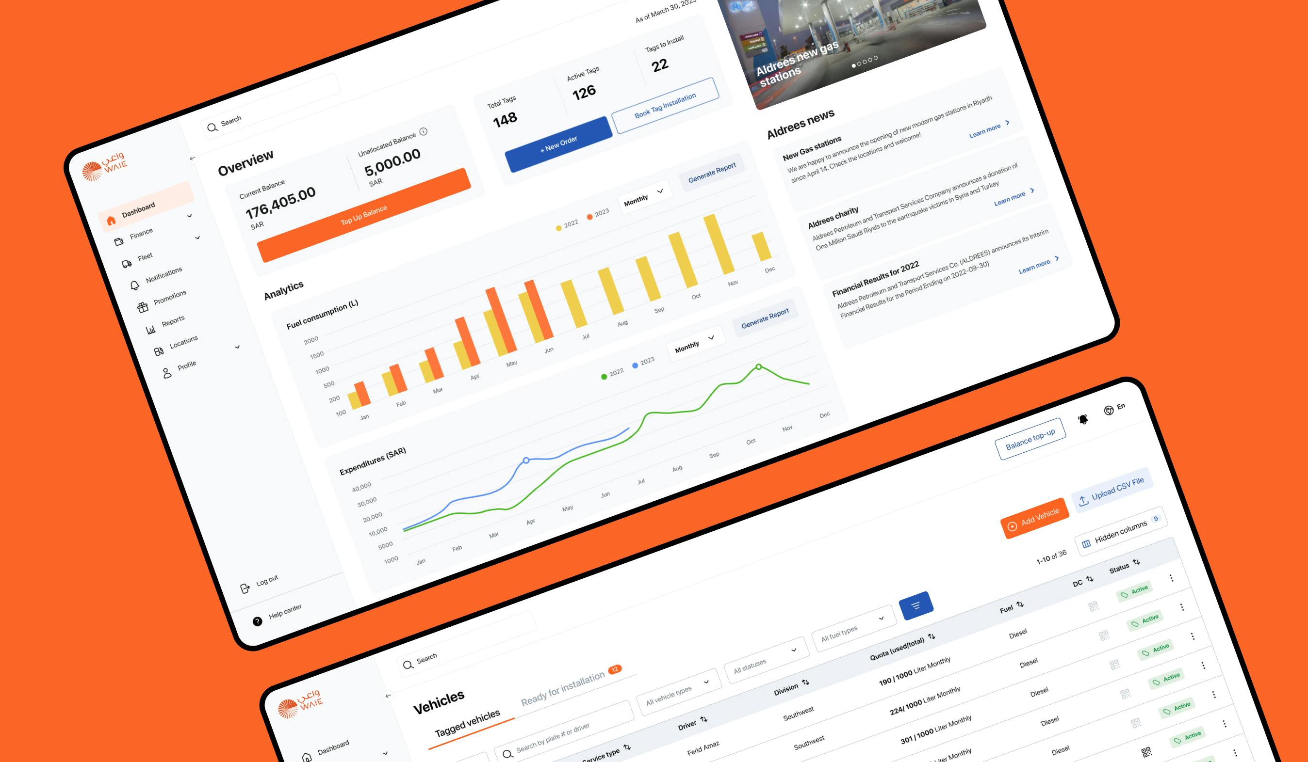
We developed intuitive usability in the Dashboard, prioritizing visual clarity and data relevance.
My primary focus was to construct a dashboard that offers users a comprehensive overview of company performance along with seamless access to key system functionalities. Grounded in research findings, I filled the dashboard with relevant metrics, using efficient data visualization techniques while considering the data ink ratio. This enhancement significantly improved the user experience, enabling users to grasp information swiftly and effortlessly.
During the initial testing, we were able to validate assumptions based on our customers main pain points and also help customer service to reduce the number of calls related to tag installation.
Assumptions validated:
- New customers registered their accounts without any issues
- New customers knew exactly what to do on the platform after signing-in.
- New and old customers confirmed the data demonstrated on the dashboard is relevant.
- New and old customers could easily manipulate their vehicles in bulk and perform the key actions.
- New and old customers could easily find the path to schedule tag installation since the new welcome experience provides clear steps and guidance to this new feature.
These strategic initiatives led to x2 increase in customer retention rates and an impressive 82% improvement in customer satisfaction.
Results in numbers
Continuously enhance the customer-centric experience with WAIE, with a primary focus on corporate customers.
The aim is to make accessing contactless gas service as effortless as receiving free food samples in a store. Users should perceive the value within a few clicks and minimal physical involvement. This may involve exploring alternative tag installation methods and leveraging technical enhancements on the back-end.
Next WORKS


Reducing bounce rate from 90% to 54% through better user experience for the consulting company.
Elevating Sergio Jimenez's 18-year expertise into a vibrant, cinematic, and trustworthy web representation
