
Rebranded Sergio Jimenez as a trustworthy and unique animation and VFX creator, transforming the old website into a vibrant new experience.
UI/UX Designer
Branding
Experience Design
Visual Design
March - June 2022 (3 months)
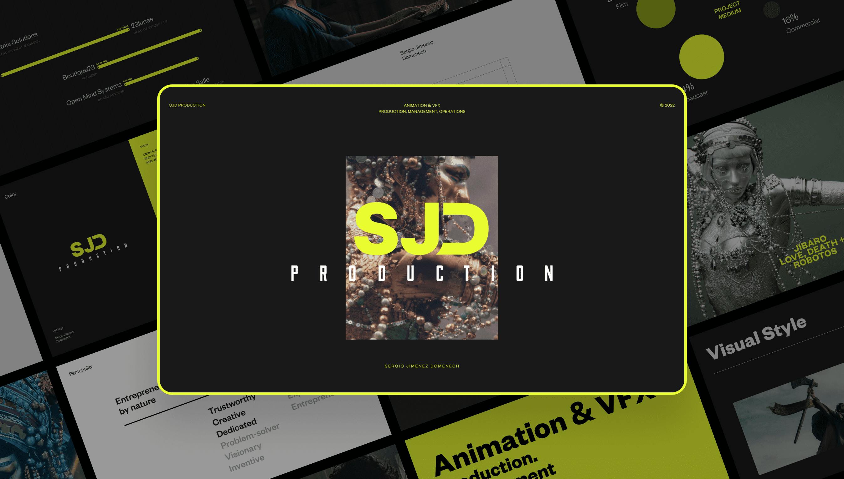
SJD Production, a UK-based studio, specializes in animation and visual effects (VFX) for films and commercials. Sergio Jimenez, the studio’s owner, boasts 18 years of expertise in creating captivating animation and VFX for cinematography.
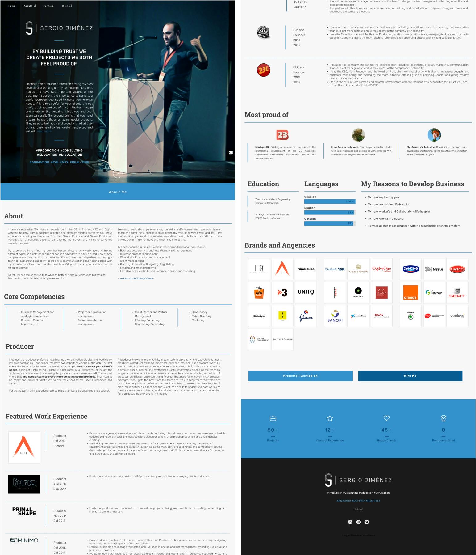
SJD Production’s existing website fell short of showcasing Sergio’s full professionalism and potential.
While it contained extensive details about his professional journey, it lacked a cohesive storytelling approach that would engage and retain visitors. The initial landing page looked like a dense resume, overwhelming users with lengthy texts. Furthermore, the small font size made the content challenging to read. Sergio assists animation and VFX companies in creating amazing visuals and content. He needed a website that would match the same visual level and clearly convey the value he can provide.
As the sole designer on this project, I took charge of both user experience (UX) and visual design.
I collaborated closely with the project manager and the development team. Engaging directly with Sergio, I presented my work, gathered feedback, and iteratively refined the design. Balancing the client's vision with technical feasibility within budgetary constraints posed a creative challenge.
Our primary objective was to reimagine Sergio’s positioning and visual representation.
We aimed to strike a delicate balance between his personal reliability and an authentic, engaging visual presence. Our target audience consisted of industry professionals in cinematography and commercials. The transformation involved transitioning from a rigid, formal “resume” style to a vibrant, yet professional look.
By incorporating these changes, your case study will better convey the project’s context, challenges, and outcomes. Remember to emphasize the impact of your design decisions and how they aligned with the client’s goals. Good luck with your portfolio case study! 🚀
Creating a first impression with impact
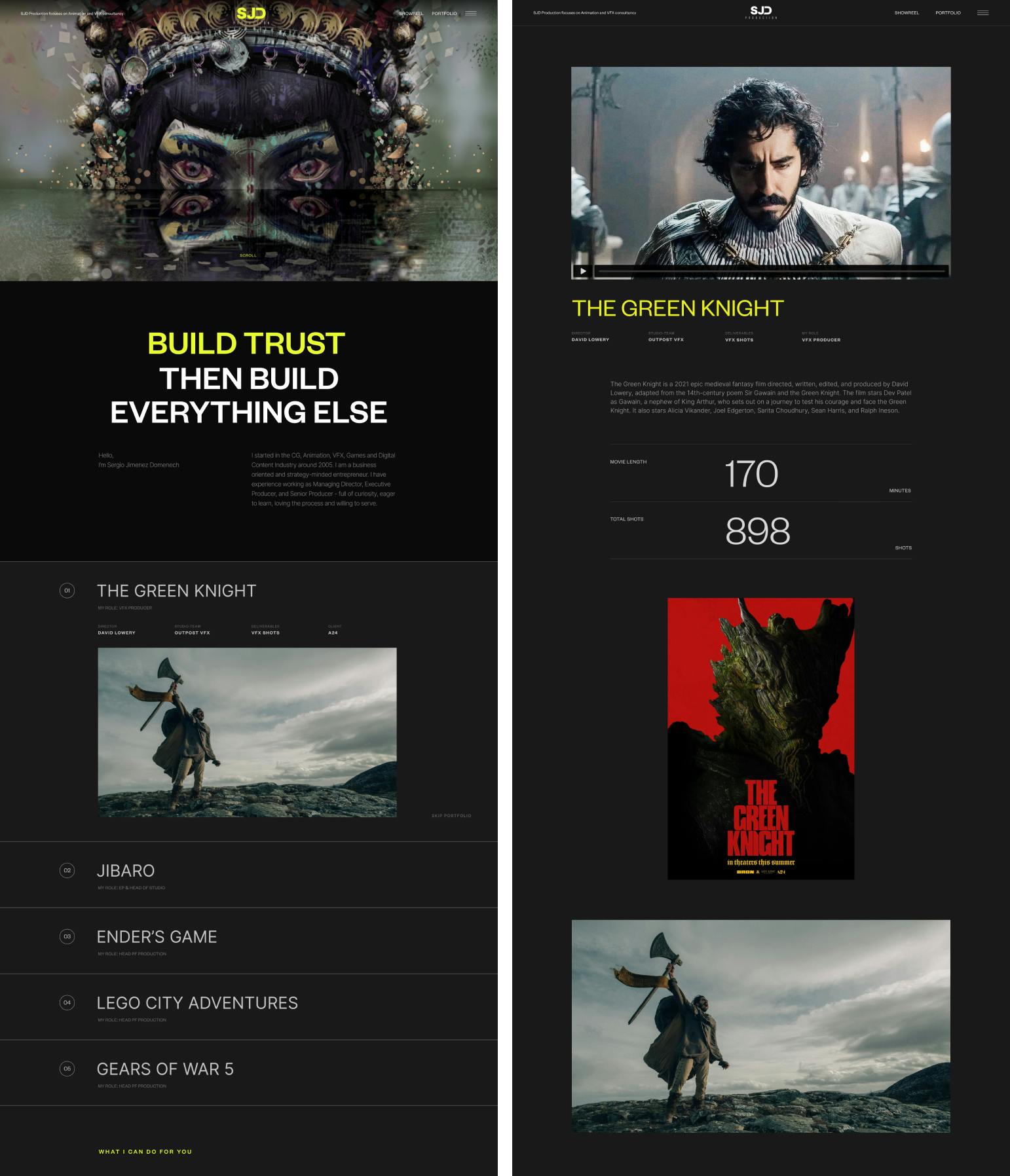
The first screen is where users make their initial contact with the website, and it has to be truly meaningful. As Sergio produces video effects for films and commercials, I immediately introduced his work to the users with one of his latest projects on the intro screen. Paired with dynamic components, I gave users a clear understanding of Sergio’s specialization in a fun way without overwhelming them with text.
Enhancing the overall experience with look and feel that matches the industry
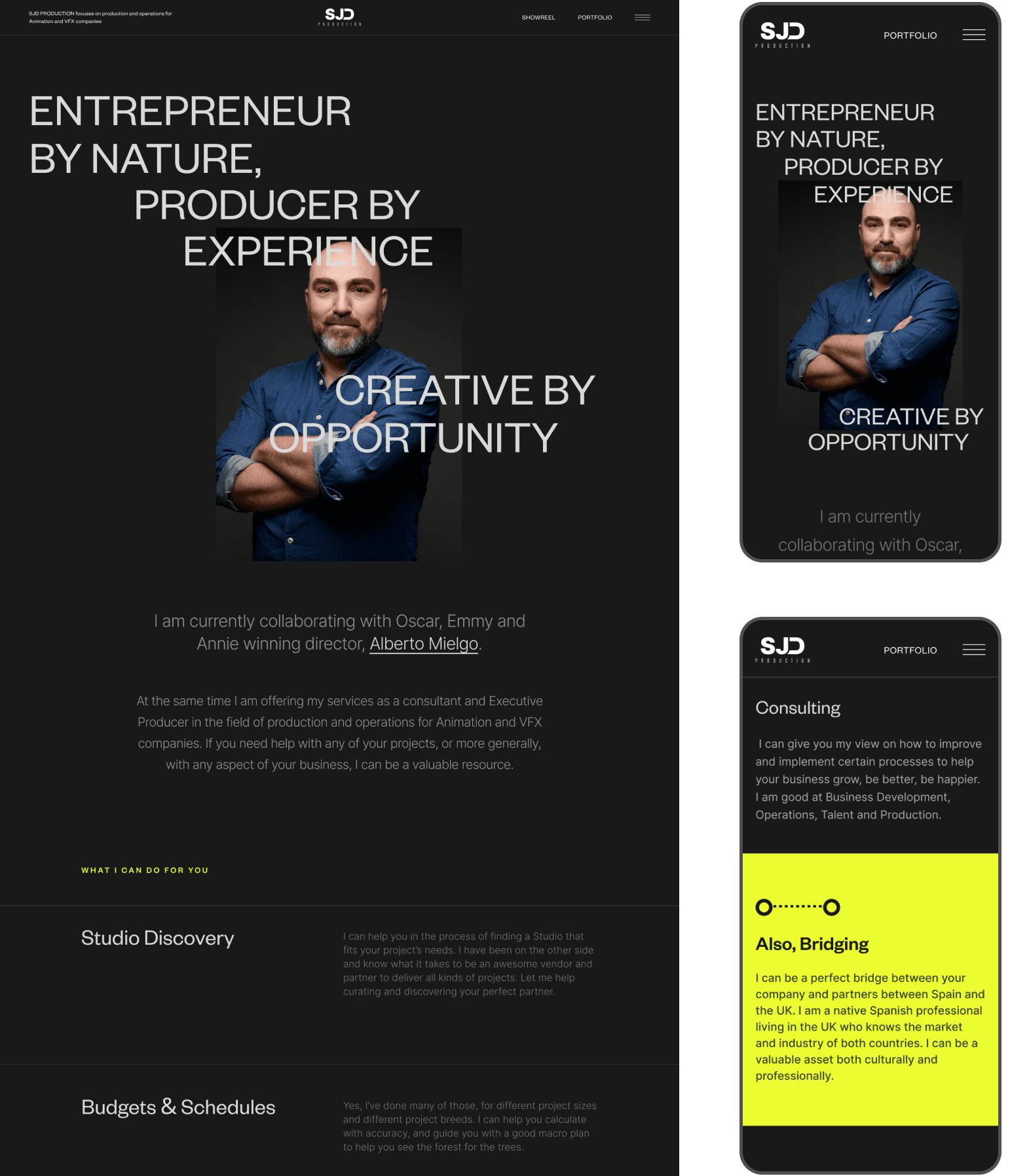
While Sergio runs a studio, it is mainly presented by his personal services. One of our goals was to convey his personality through the visual style, giving room to personal branding foundation. I shifted from a formal “resume” style to a more vivid and tech feeling, creating a fresh modern look. Inspired by the contrast of a dark theater room and bright projection screen, I opted for a dark theme for the site. This created a cinematic presence effect that resonated with the industry of Sergio’s work. I used bold yellow as the only accent color and opted for a more legible typeface and bigger fonts to maintain a clean but distinctive visual style. These updates resulted in a website that looks and feels close to user expectations, considering that business sector.
Shifting focus from texts to visual components and imagery
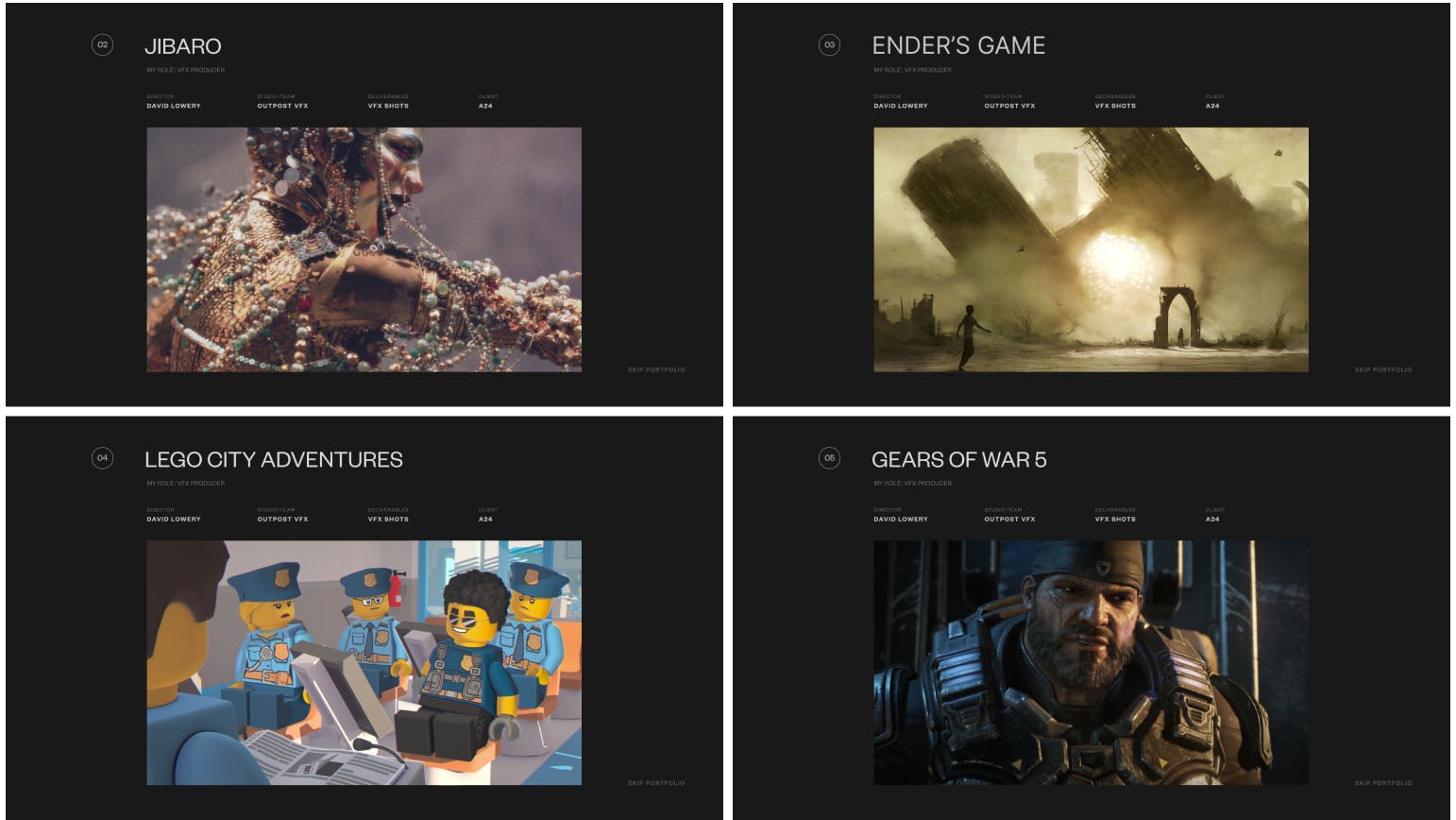
I strongly believe that the most effective method to present video creations is through the video format. To achieve this, I shifted from long reads to a more interactive layout with video content blocks alternating with brief text content. I also added some visual components to text blocks to make them more engaging and fun.
Instantly immersing users into Sergio’s work
To keep users engaged with the content, I added autoplay to the project video previews. Videos start playing once they become visible on the screen while users scroll the page and are fully muted. This captures user attention and allows them to quickly overview a piece of work before they want to learn more about a specific project. Additionally, we incorporated smooth animations into the page transitions, adding a seamless flow to the user journey.
Optimizing website performance
To improve the performance and prevent videos from freezing, we strategically chose to host Sergio’s video portfolio on Vimeo. This decision not only reduced page loading times but also ensured a smooth playback experience for visitors, allowing them to fully appreciate the quality of Sergio’s work without any interruptions.
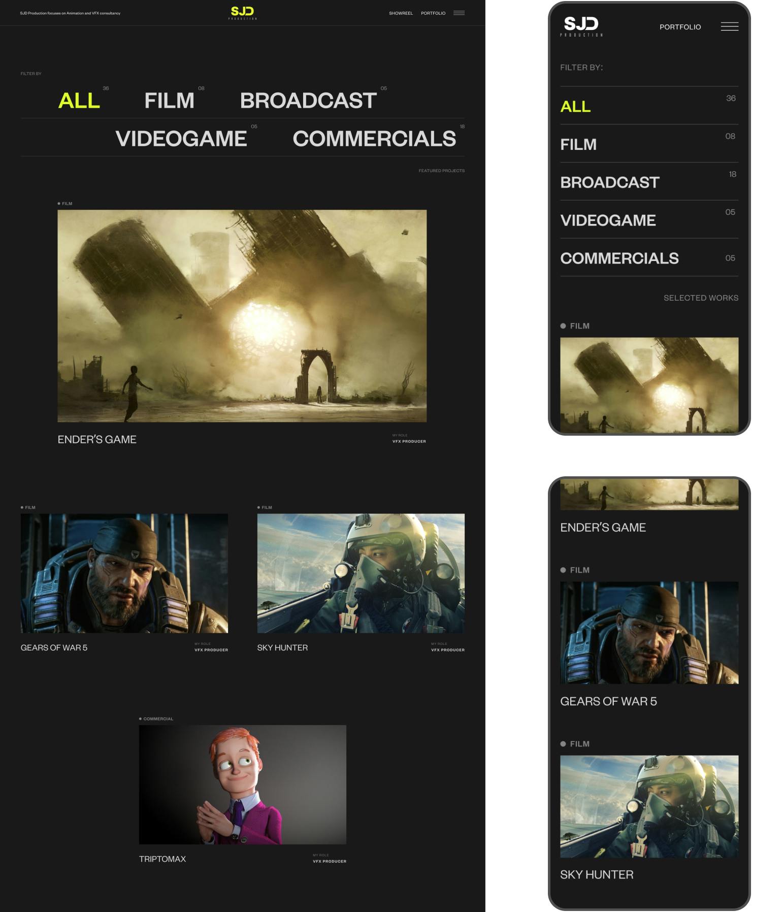
SJD Production rebranded as a trustworthy and unique animation and VFX creator.
One of Sergio’s key objectives was to convey the importance of building trust with potential clients. To achieve this, I positioned Sergio as a dependable and experienced player in the industry, showcasing his professional journey and work, thereby proving his trustworthiness.
The rebranding received an overwhelmingly positive response from users for its authentic and friendly aesthetic. The site successfully captures the essence of Sergio’s craft, communicating his expertise and values to the audience. It is fully responsive, timeless, and functional.
I got an easy to use and maintain website based on Wordpress, with a unique design specifically tailored for my needs. Great design, and overall great experience!
Sergio Jimenez
Owner, SJD Production
Next WORKS
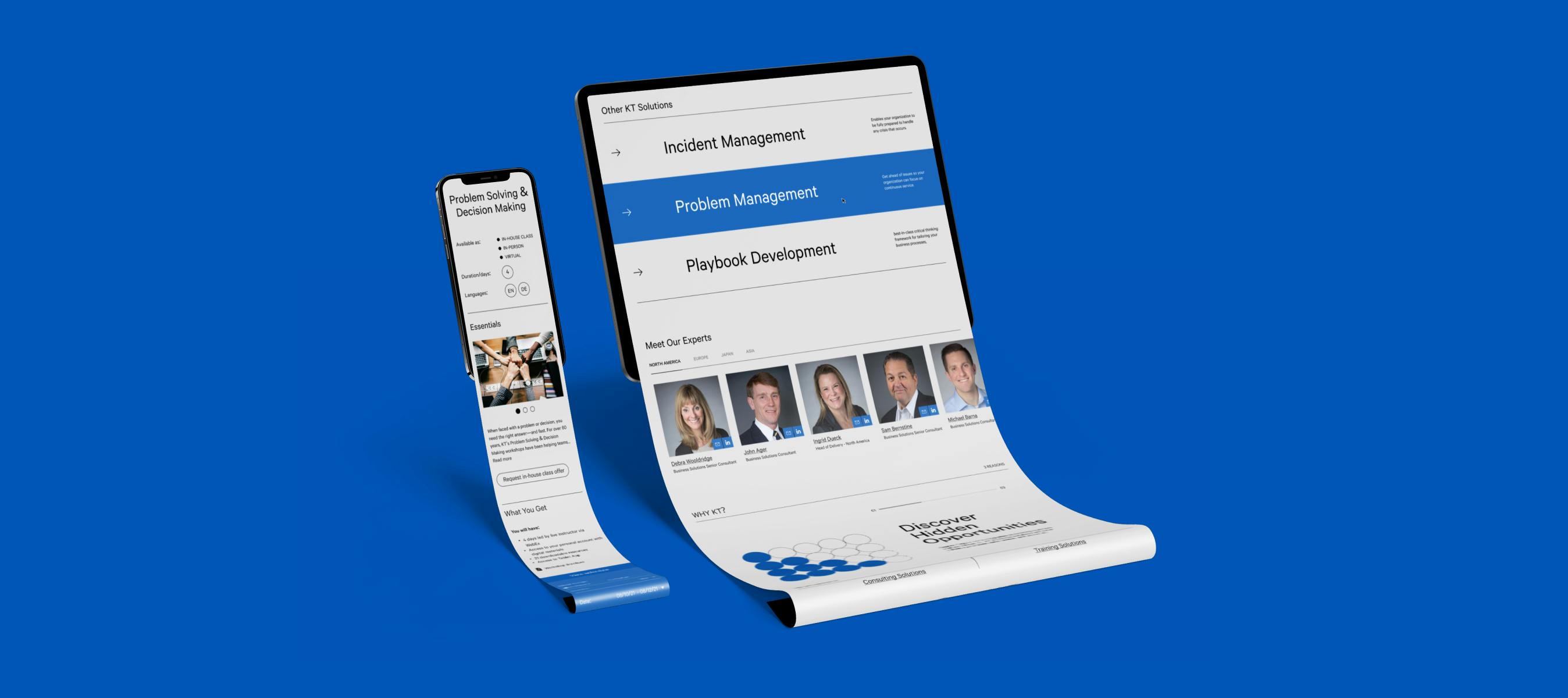


Reducing bounce rate from 90% to 54% through better user experience for the consulting company.
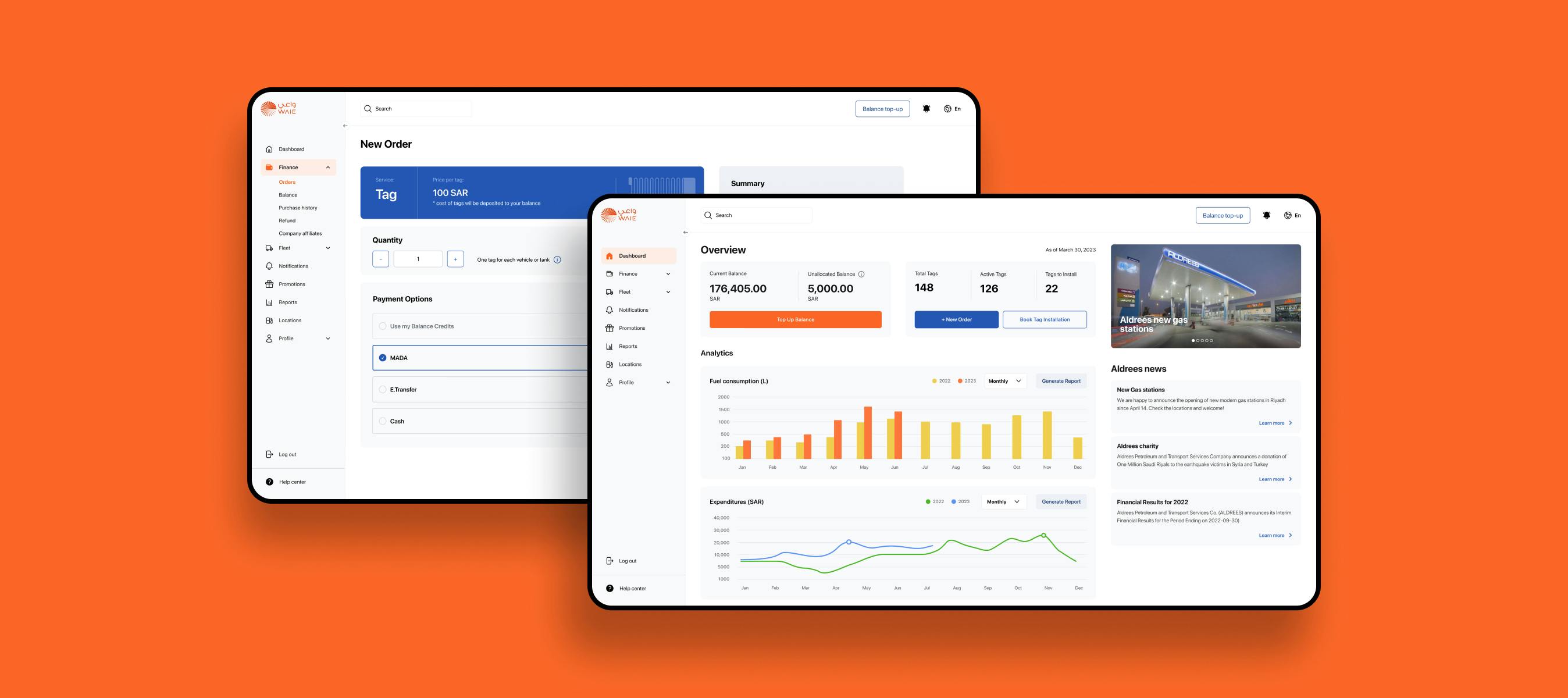


Enhancing user experience for corporate efficiency. Doubling user retention and increasing user satisfaction by 82%.

